This week in my senior seminar on the reproducibility crisis in science (Gilmore 2023) we discussed the “many analysts” paper (R. Silberzahn et al. 2018). The main take home message is that different data analysts can take widely varied approaches to answering the same question from the same dataset. It’s a fun and fascinating read.
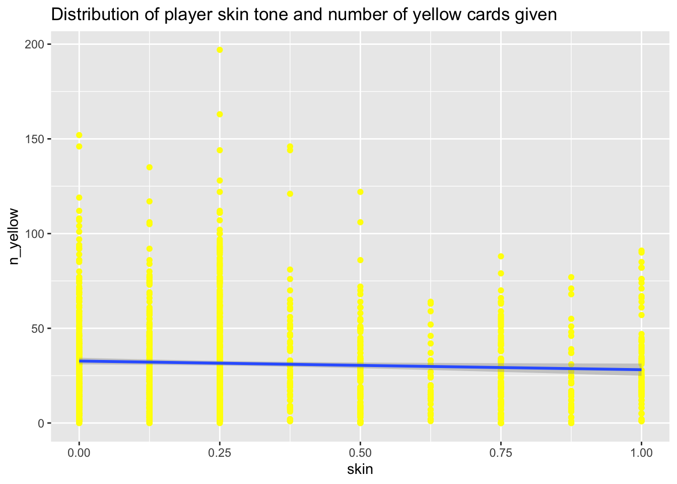
But after asking the students whether or not the paper had persuaded them that players with darker skin tones get more red cards, I realized that nowhere in the paper was a graph that addressed this particular question. So, I got busy trying to work through just how one might explore that question graphically.
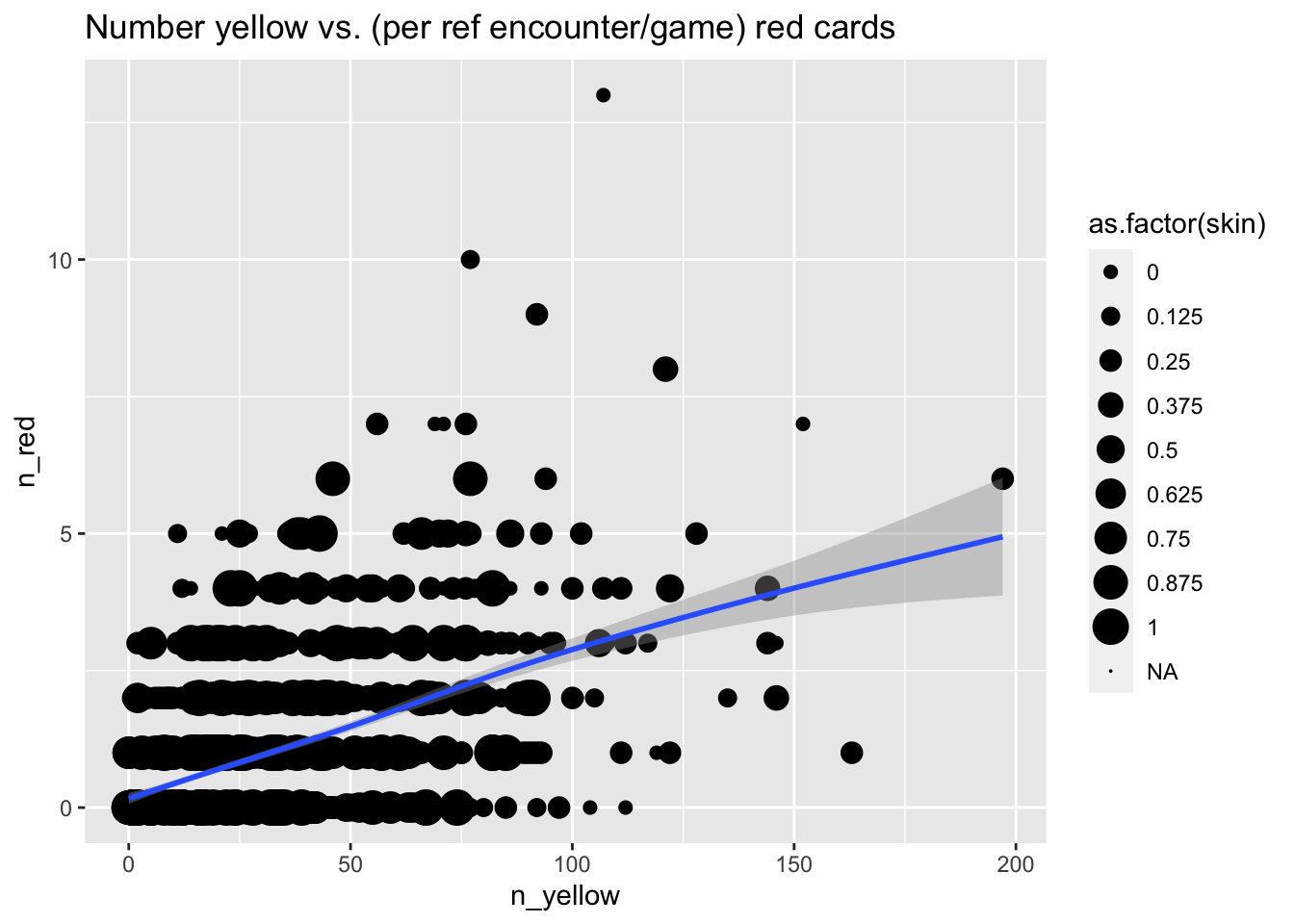
The result is a whole page of graphs. Probably the least surprising are the ones showing that the number of yellow cards and red cards are related to one another, whether viewed from a player perspective
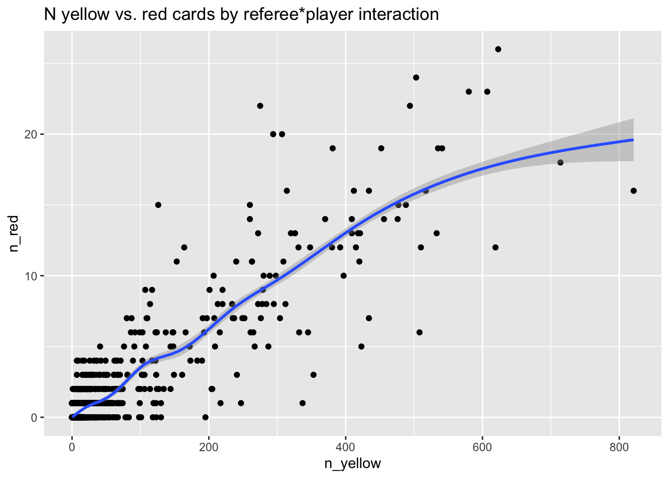
or from a referee perspective
But I confess to trying many times, and failing, to find a way to show that skin tone has anything to do with the number of red or yellow cards given out.
Not only does this remind me again how important plotting data can be (see here), but it also makes me wonder what we actually know about how scientists think about generating these sorts of graphs, how the graphs contribute to scientific reasoning, and how others understand them. Those sound like interesting research questions, don’t they?
Kudos to the authors for sharing their data on the Open Science Framework (R. Silberzahn et al. 2023), and especially Brian Nosek, Jeff Spies, and their colleagues for creating a tool that makes data sharing so easy. The osfr package made it really easy for me to create a reproducible workflow that downloads the data. And Quarto made it easy for me to make those workflows transparent to others.